
KULTURE KOMBUCHA


OBJECTIVE
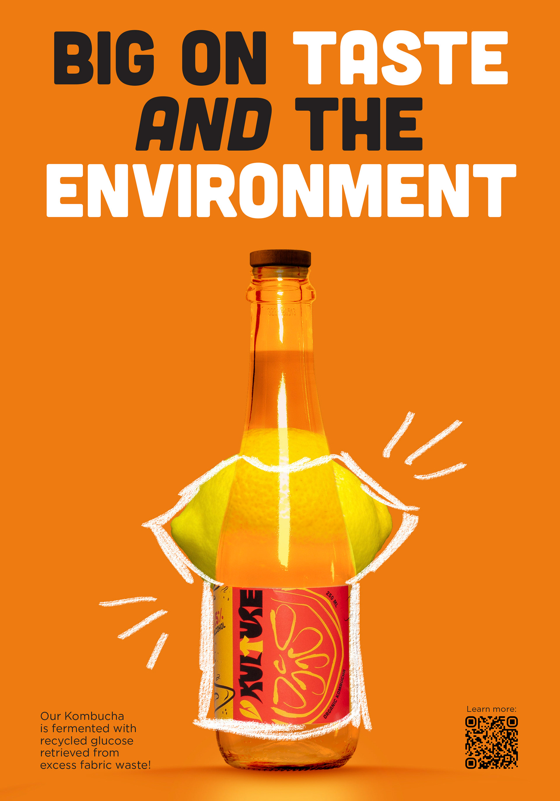
To design a label that accurately represents the unique process behind the brand. The company was open to a rebrand centred around their Kombucha line that incorporates recycled glucose broken down from textile waste.
PROCESS
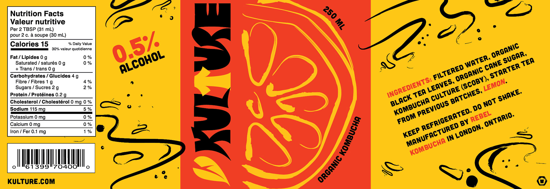
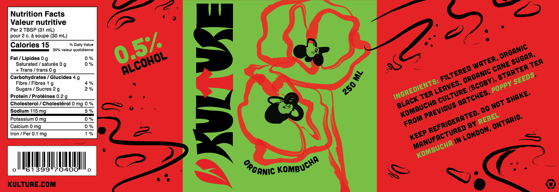
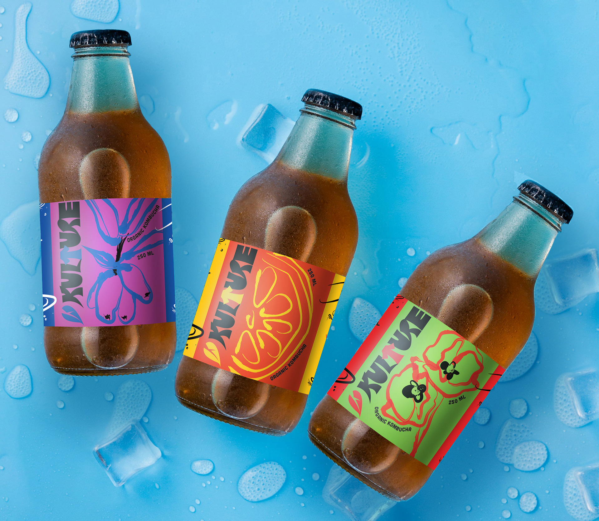
"Kulture" plays on how bacteria is cultured to produce Kombucha while also invoking a sense of community. The graphic elements take that further, mirroring bacteria in petri dishes. The colour palette is informed by pop-art, largely because it jumps off the shelves, and because it was the first instance of counter-culture and the growing accessibility of art. This speaks to the target audience of artistically inclined, community-oriented 25-50 year olds (echoing characteristics of the '60s hippie subculture).
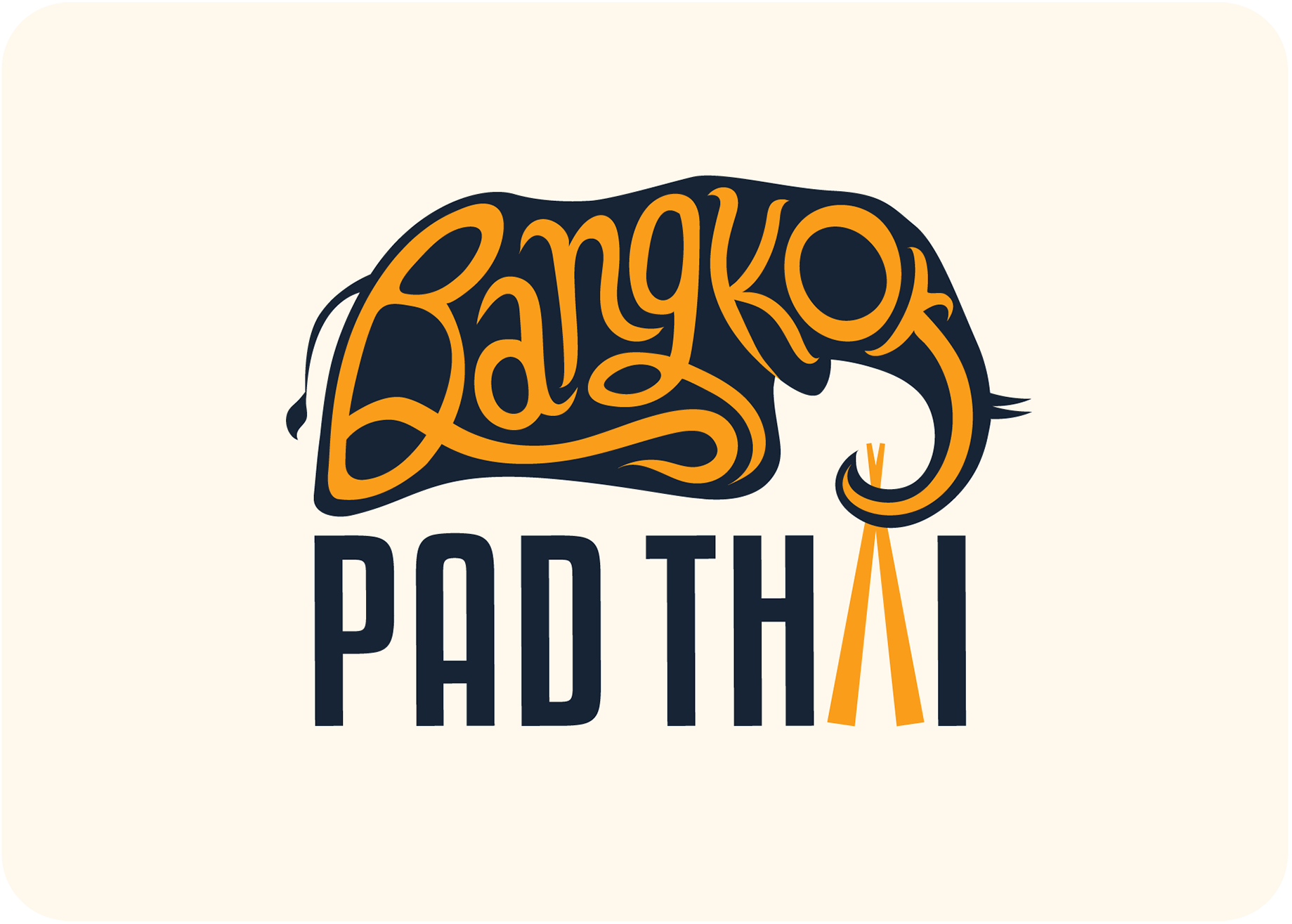
BANGKOK PAD THAI

OBJECTIVE
To rebrand an existing restaurant.
PROCESS
I wanted the rebrand for this restaurant to feel modern and cohesive, hence the colour palette consisting of a timeless light and dark, along with a pop of orange to pull everything together as an accent. Due to the self-explanatory nature of the restaurant's name, I relied more on iconography to build the new logo. The rebrand is clean, minimal, and elevated with both flat and isometric-inspired illustrations across assets.
TAKEAWAYS
This project presented me with the opportunity to create my first style guide, and it was really eye-opening to see how much specificity is required to create easily comprehensible branding standards.


